
How to map and visualise your martech stack
Data Engineer and Co-founder, martechdevs
Last updated 11 min read
A useful martech stack map shows which systems perform a business job, what passes between them and who owns each connection. Start with one customer journey, draw the actual data flow and attach evidence to the important arrows. Then build broader views for ownership, cost or future architecture. That gives you a map people can use to diagnose a problem or plan a change.
Last updated: 16 September 2026.
The first test is simple: could a new marketing leader use the map to explain how a trial becomes an active customer, and where to look when the follow-up goes wrong? If the answer is no, adding more logos will not help.
This guide includes a copyable template and an illustrative workflow. For the wider commercial and operational review, use the martech stack audit guide.
Decide what this particular map must explain
A board presentation, an onboarding document and an integration investigation need different levels of detail. Set the audience and question at the top of the diagram.
For example: “Current trial onboarding for the self-serve product, production environment, reviewed 13 October.” That scope excludes the enterprise sales process, a retired product and the test environment. You can map those separately without pretending they are identical.
Choose an output that makes the next decision easier:
- A new leader needs ownership: show capabilities, systems and responsible teams.
- Growth sees the wrong lifecycle messages: show the events, status updates and eligibility checks that lead to a send.
- Finance is reviewing renewals: connect paid products with used capabilities and dependent workflows.
- Engineering is planning a replacement: show interfaces, identifiers, timing requirements and downstream consumers.
- The founder is considering AI: show the data, definitions, permitted actions and review points the proposed agent would depend on.
Keep the main question visible. A single diagram rarely serves all five audiences well. Separate views can share one underlying inventory, so you maintain the facts once while presenting the detail each audience needs.
Choose a layout deliberately
Scott Brinker's catalogue of martech stack visualisations identifies ten recurring approaches. In practical terms, they organise a stack by:
- The product categories represented.
- The stages of the customer relationship.
- Customer-facing versus internal work.
- The teams or job roles using it.
- The central platforms and surrounding integrations.
- How much time people spend in each tool.
- How much work is automated.
- How quickly different systems should change.
- How the portfolio has evolved.
- The capabilities and their relationships.
The choice changes what becomes visible. A journey view exposes handoffs; a role view explains responsibility; a change-speed view helps separate experiments from dependencies that need stability. A usage view needs interpretation: a quiet background service or an occasional critical workflow can be valuable without daily human logins.
For a first working map, use the customer journey to set the scope and directional data flows to explain execution. Add owners in the supporting records. This keeps the initial drawing small enough to check against reality.
If you are unsure which journey deserves that attention, start with how to identify key customer journeys. Map the workflow whose failure changes customer experience or a current business decision.
Build the inventory before arranging boxes
Gather evidence from the places that reveal different parts of the system:
- Procurement and invoices show purchased products and commitments.
- Application administrators identify active accounts, workspaces and connected apps.
- Tag configuration and browser inspection show parts of website collection.
- Engineering identifies APIs, jobs, queues and custom services.
- Data teams identify tables, transformations and scheduled activation.
- Operators reveal CSV exports, spreadsheets and manual handoffs.
Ask what each item actually does. “CRM” is a category. “Stores account ownership and supplies the trial follow-up workflow” is a role in your business. A suite may perform several roles, while a custom script may perform one critical role that no vendor inventory captures.
Give each system a stable ID. Keep the ID if the display name changes. Treat production and sandbox installations as separate records when their connections or owners differ. Otherwise someone may verify a test connector and assume production works the same way.
For each record, capture a business owner, technical owner, purpose, environment, important data and evidence date. Keep credentials out of the inventory. Reference the controlled configuration location instead of copying secrets into a diagram that will circulate widely.
Record unknowns explicitly. “Owner unconfirmed” is useful because it creates a follow-up. Assigning the nearest available person's name makes the map look complete while hiding the gap.
Define every arrow as a transfer or interaction
An arrow labelled “integration” leaves too much unanswered. Readers need to know what it carries and what depends on it.
For each important connection, record the source, destination, object or event, matching key, trigger, expected delay and failure owner. Add which system controls the relevant fields and how corrections propagate. A two-way connector needs two directional descriptions if the data or ownership differs.
For example, a CRM may own account manager assignment while billing owns payment status. A broad bidirectional arrow labelled “customer sync” conceals that authority split. Name the actual fields or concepts and record the conflict rule.
Separate configured, observed and proposed. A connector can be installed without carrying the records your workflow needs. A future-state arrow is a design intention. An observed arrow has evidence from the relevant environment and a date.
HubSpot's Connected Apps documentation describes connection status, activity and record insights that can support this investigation. It also notes that some app types do not display particular status or last-activity information. Missing interface data is a reason to inspect another source, not evidence that a connection is unused.
You do not need a full software architecture notation to make the diagram understandable. The C4 diagram review checklist provides useful communication checks: scope, meaningful names, a legend and labelled directional relationships. Apply those checks even if you draw in a basic slide editor.
A worked example: stopping an irrelevant trial email
Consider a fictional SaaS company whose trial users sometimes receive setup reminders after they have activated or paid. The map's job is to explain how the send decision obtains current account status and communication preferences.
The following is an illustrative design, not a verified production system or a claim about a particular vendor integration. Each arrow labels the information or action involved. The account data model is a logical role; a small business might implement it within an existing database rather than purchasing a warehouse.
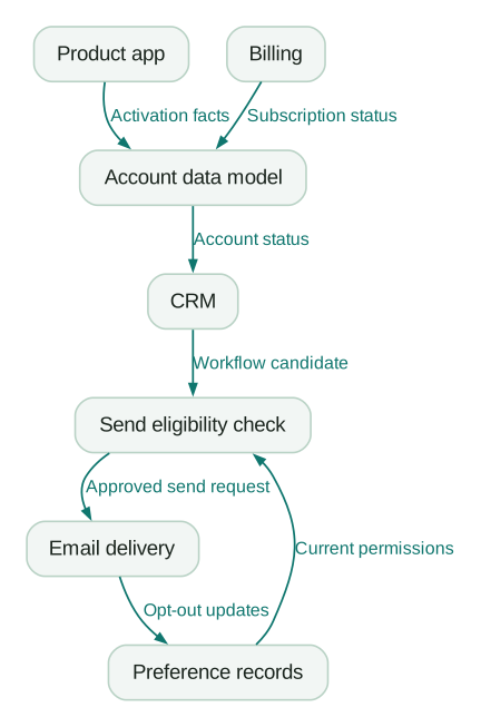
Read the arrows in terms of failure. If billing changes today but the account model refreshes tomorrow, a correctly configured CRM rule may still use yesterday's information. If the workflow checks status only when somebody enters a multi-day wait, it may act on a state that has since changed. If opt-out updates arrive late, the stored permission may be stale.
The picture alone does not solve those problems. Attach the actual refresh schedule and recheck behaviour to each relevant connection. Decide how fresh the information must be for this message, and what happens when freshness cannot be established. For a nonessential setup reminder, deferring an uncertain send may be preferable to sending it to an ineligible customer.
The eligibility check is a capability, not necessarily another tool. It could run within a messaging platform, a CRM workflow or application code. The map must show where the check actually happens and which state it reads.
This example also makes a missing relationship visible: does the eligibility check obtain sufficiently current account status through the CRM, or does it need another approved lookup? Mark that as an unresolved design question until the timing requirement is tested. Do not draw a direct connection simply because you hope it exists.
Copyable martech stack template
Use two sheets: Systems and Connections. The sample rows below correspond to the illustrative diagram. Replace them with your own records. Every sample connection starts as proposed; none is presented as observed evidence.
Create the Systems sheet from this CSV:
system_id,name,role,environment,business_owner,technical_owner
S1,Product app,Creates activation facts,production,TBD,TBD
S2,Account data model,Combines account state,production,TBD,TBD
S3,Billing,Owns subscription status,production,TBD,TBD
S4,CRM,Coordinates lifecycle work,production,TBD,TBD
S5,Send eligibility check,Evaluates the candidate,production,TBD,TBD
S6,Preference records,Stores communication choices,production,TBD,TBD
S7,Email delivery,Executes approved sends,production,TBD,TBD
Create the Connections sheet from this CSV:
connection_id,source_id,destination_id,object_or_action,match_key,status
C1,S1,S2,Activation facts,account_id,proposed
C2,S3,S2,Subscription status,billing_account_mapping,proposed
C3,S2,S4,Account status,crm_account_mapping,proposed
C4,S4,S5,Workflow candidate,account_and_recipient_id,proposed
C5,S6,S5,Current permissions,recipient_id,proposed
C6,S5,S7,Approved send request,message_and_recipient_id,proposed
C7,S7,S6,Opt-out updates,recipient_id,proposed
Add these columns to Connections as you investigate: trigger, expected_delay, field_authority, failure_owner, evidence_reference, checked_at and open_question. Keep a separate proposed service requirement from the observed behaviour. “Must update within five minutes” and “last observed update took eighteen minutes” should be able to coexist in the record.
The matching keys above are descriptive placeholders, not universal vendor field names. For example, billing_account_mapping means you need a maintained relationship between the billing customer and your account entity. Document where that relationship lives and what happens when it is missing. See the single customer view guide for the distinction between people, accounts and identifiers.
Add a decision log alongside the sheets. Each entry should name the question, affected connection IDs, evidence still needed, decision owner and next action. That turns “the diagram has a gap” into work somebody can complete.
What the five-ring model adds
In his March 2026 composable-canvas explanation, Scott Brinker describes an architecture organised around five rings, moving outward:
- Data Core: the shared information foundation.
- Semantic Layer: common meaning and governed definitions.
- CaaS, or context-as-a-service: relevant information and services assembled for a particular domain.
- Decisioning: selecting what to do with that context.
- Apps & Agents: the software carrying out work and delivering experiences.
The model allows capabilities to be embedded in a platform or integrated from elsewhere. It is a way to discuss responsibility and composition, not a requirement to buy five products.
The accompanying Databricks research page presents the work as a three-to-five-year architectural vision. Treat it as a direction for design discussions, rather than proof that every current stack already operates this way.
Apply it to the trial example as a set of questions. Where are subscription facts stored? Who defines “activated”? What information is assembled for the reminder decision? Which rule chooses to send? Which application executes that choice? One existing application may answer several questions.
Map the present answers first. If an AI assistant is proposed later, identify the definitions and access it needs, and whether it can only explain a result or also change customer-facing behaviour. Connecting an assistant to several tools does not establish those responsibilities by itself.
What a URL detector and a market map can tell you
A website technology lookup can provide a useful starting inventory of visible technologies. Wappalyzer's lookup identifies categories such as content management, analytics and infrastructure. Its collection explanation describes public web signals and crawler/browser-extension evidence.
That scope matters. A detected analytics script does not prove that its events are correct, that somebody uses its reports or that its contract is active. A missing browser signal does not establish the absence of a warehouse, a backend API integration or a tool used only after login. Treat detection as evidence to investigate, with a URL and observation date.
The MartechMap landscape serves a different job: discovering vendors and categories. The 2026 landscape release links to its searchable, filterable interactive version. It is a market reference, not an inventory of your company's installed tools or verified data flows.
You can therefore use a detector to seed visible systems and a market catalogue to clarify categories. Complete the working map with administrative evidence, engineering input and representative records. Neither a URL scan nor a polished landscape can establish the internal relationships for you.
Review the map with people who run the workflow
Ask the business owner to walk through the diagram from a real starting condition to the intended outcome. Then ask the technical owner what each arrow means in the implementation. Differences between those explanations are useful findings.
Use a normal case and a difficult case: a cancellation during a delay, a changed email address, a person in two accounts or a failed update that is replayed. Record which facts and identifiers are available at each point. Expand only the portion of the map needed to explain the failure.
When ordering matters, a focused interaction view can help. The C4 dynamic-diagram guidance recommends these views for specific features or complicated interactions. A separate view of “payment arrives while a reminder is queued” can be clearer than adding every possible timing condition to the whole-stack drawing.
Give the map a review owner and update it when a system, interface, identifier, permission or workflow changes. Keep current and proposed versions distinct. Archive a superseded version with its date so an incident investigation can establish what was believed to be true at the time.
Handover checklist
- The diagram names its audience, question, environment and date.
- Every system has a stable ID and a specific business role.
- Business and technical owners are recorded or explicitly unknown.
- Important arrows identify direction and meaning.
- Matching keys and field authority are documented.
- Required freshness and observed timing are separate.
- Configured, observed and proposed connections are distinguishable.
- Manual steps and custom code are included where they affect the workflow.
- A normal and an exception case have been walked through.
- Open questions have owners and next actions.
- The shared version contains no credentials or unnecessary customer records.
- Someone owns updates when the implementation changes.
A completed map should make the next fix obvious enough to describe. “The payment status reaches the send decision too late” is actionable. “We have too many tools” needs more investigation. If the problem spans systems and nobody owns the handoff, martech integration work can turn the documented requirement into an implemented and checked connection.
Questions people ask
What should a martech stack diagram include?
Include the systems needed for its stated scope, their business roles and the important directional relationships. Add a title, environment, date and legend. Keep ownership, matching keys, timing requirements and evidence in linked records when displaying them all would make the diagram unreadable.
Which martech stack layout should I use first?
For an operational problem, start with one customer journey and show how the relevant systems exchange information or trigger actions. For onboarding or budgeting, a capability and ownership view may be more useful. Choose the view from the question and maintain additional views from the same inventory.
Can I generate my complete martech stack from a website URL?
You can discover some public-facing technologies that way. You cannot establish the full internal stack, contracts, permissions or correctness of data flows from that evidence alone. Confirm detected items and supplement them with connected-app records, engineering knowledge and business-owner input.
Is a spreadsheet enough, or do I need a stack builder?
A spreadsheet for systems and connections, plus a basic diagram editor, is enough to create the first useful map. A specialised builder may help when you need many maintained views, collaboration or portfolio management. Evaluate how easily it preserves stable IDs, evidence, owners and exports before moving the inventory into it.
How is mapping different from a martech stack audit?
Mapping documents the systems and relationships needed to explain a workflow. An audit uses that map alongside tests, costs, contracts and business requirements to assess what should change. The map supports the audit, but drawing a connection does not establish that it works or delivers value.
Sources
- Chiefmartec's ten approaches to stack visualisation
- HubSpot Connected Apps documentation
- C4 diagram review checklist
- Scott Brinker's composable-canvas and five-ring model
- Databricks: The New Martech Stack for the AI Age
- Wappalyzer technology lookup
- Wappalyzer collection and public-signal explanation
- MartechMap
- Chiefmartec's 2026 landscape release
- C4 dynamic diagrams
Written by
Jafrin Akter AloData Engineer and Co-founder, martechdevs
Jafrin Akter Alo is a data engineer and co-founder of martechdevs, where the team has delivered 74+ martech, data and growth stack implementations.